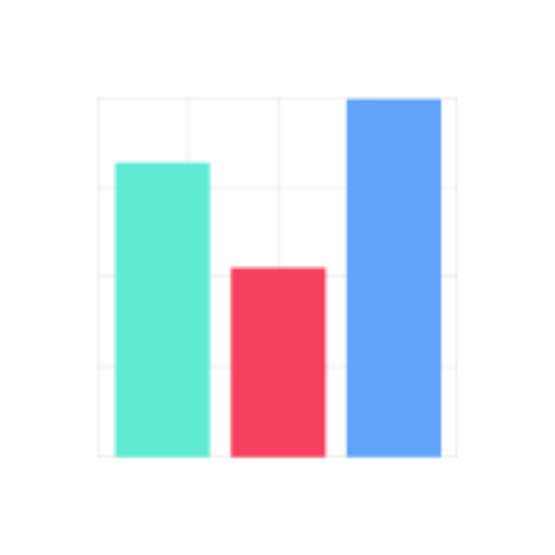
Data Visualizer-AI-driven data visualization tool
AI-powered insights, simplified data analysis.
Can you create a bar chart from this data?
Explain linear regression in simple terms.
How do I clean this dataset?
Analyze the trends in this Excel file.
Related Tools
Load More
Diagrams & Data: Research, Analyze, Visualize
Complex Visualizations (Diagram & Charts), Data Analysis & Reseach. For Coders: Visualize Databases, UserFlows, ERD, PlantUML and More. For business & data analysis: Mindmaps, Flowcharts and more.
Data Visualization Expert
A data viz expert specialized in creating charts and graphs from user-provided data with the knowledge to apply best practices for visual encoding, accessibility, and offer contextual suggestions for visualization types based on the provided data and inte

Data Visualizer 👉 Graphs 👉 Charts
Creates data visualizations, graphs, and charts.

Data Vizard
A data visualization wizard who can help you create beautiful charts and graphs.

数据图表匠人
我是数据图表匠人,专业将数据转化为图表。请上传想要制作图表所使用的数据,同时告知我你想要制作图表的内容和主题。

Interactive data visualization
Upload a csv or xlsx document and ask a question
20.0 / 5 (200 votes)
Introduction to Data Visualizer
Data Visualizer is a specialized AI designed to assist with the analysis and visualization of data. Its core purpose is to enable users to make sense of complex datasets by transforming raw data into clear, insightful visual representations. The tool excels in handling numerical, textual, and basic image data, using Python and various libraries like Pandas, Matplotlib, Seaborn, and NumPy. The main focus of Data Visualizer is not just data processing but also making it interpretable through visual tools like graphs, charts, and statistical summaries. A key design element is its ability to customize analyses based on user-provided data files (e.g., CSV, Excel) and offer real-time feedback on trends, patterns, or outliers. For instance, if a user uploads a sales dataset, Data Visualizer can create time series plots to show sales trends over months, or generate bar charts to compare different product categories. It's built to provide clear, actionable insights in scenarios such as business performance tracking, research data analysis, and financial forecasting.

Key Functions of Data Visualizer
Data Processing
 Example
Handling CSV and Excel files for cleaning, summarizing, and structuring data.
ScenarioA business analyst uploads a CSV file of customer transactions and uses Data Visualizer to clean missing entries, standardize date formats, and summarize monthly revenue.
Data Visualization
ExampleCreating charts, graphs, and plots from numerical data.
ScenarioA researcher uses Data Visualizer to generate histograms and scatter plots to study the distribution and relationship between variables in an academic study, such as income vs. education levels.
Statistical Analysis
ExamplePerforming statistical tests, correlations, or regressions on datasets.
ScenarioA financial analyst applies regression analysis to stock market data using Data Visualizer to predict future stock prices based on historical trends.
Target Users of Data Visualizer
Data Analysts and Scientists
These users work with large amounts of data and require tools for data cleaning, analysis, and visualization. They would benefit from Data Visualizer's ability to process datasets and extract meaningful insights through statistical analysis and visual aids.
Business Professionals and Decision Makers
Business professionals who need to make data-driven decisions would find Data Visualizer useful for understanding trends, performance metrics, and customer behavior. It enables them to quickly generate reports and visual summaries of their data.
How to Use Data Visualizer
Step 1
Visit aichatonline.org for a free trial without login, no need for ChatGPT Plus. This provides immediate access to the Data Visualizer for new users.
Step 2
Upload your dataset or file (CSV, Excel, or other compatible formats). Ensure your data is structured correctly for analysis (e.g., clean columns, labeled data).
Step 3
Select the analysis or visualization method you need, whether it's generating statistical insights, exploring trends, or creating graphs and charts. Options like histograms, scatter plots, or time series visualization are available.
Step 4
Review and interpret the results. The tool will provide detailed charts, visual outputs, or statistical summaries based on your data, using advanced libraries like Matplotlib, Seaborn, or SciPy.
Step 5
Download or export your results. The visualizations and insights can be saved locally in various formats, such as PNG, CSV, or Excel files, for further use or reporting.
Try other advanced and practical GPTs
Introduction to Mathematical Analysis II Tutor
AI-powered tutor for advanced math analysis

Resume
AI-Powered Resume Improvement Tool

Image to Website Code
AI-powered design to code converter

L+
AI-powered personalized language tutor

Bright Sketcher
AI-Powered Illustrations for Speech Therapy
Business Coach
AI-Powered Solutions for Entrepreneurs

Perfect Bacon
AI-powered precision for culinary and beyond.

5W Avatar Creator
AI-Powered Precision for Your Target Audience

QuickyBooks Wizard AI
AI-Powered Financial Management for QuickBooks

DataDig Assistant
Your AI-powered assistant for data-driven insights
ConsultantGPT | Executive Summary for consulting
AI-driven executive summaries for consultants

Sales and Marketing : Account Research & Outbound
AI-Powered Account Research & Outreach

- Data Analysis
- Trend Analysis
- Visualization
- Machine Learning
- Research Reports
Common Questions about Data Visualizer
What types of data can Data Visualizer analyze?
Data Visualizer can process and analyze various structured data formats, including CSV, Excel, and text-based datasets. It supports numerical, categorical, and time-series data, making it suitable for statistical analysis, visualization, and even basic machine learning tasks.
Can I create custom visualizations with Data Visualizer?
Yes, Data Visualizer allows you to generate a range of visualizations like line graphs, bar charts, scatter plots, and heatmaps. You can customize them by adjusting axis labels, colors, and other aesthetic elements to better represent your data.
Is programming knowledge required to use Data Visualizer?
No, programming knowledge is not necessary. The tool is designed for both technical and non-technical users, providing an intuitive interface for uploading data, selecting visualization types, and analyzing the output without needing to write code.
How does Data Visualizer handle large datasets?
Data Visualizer is optimized for handling large datasets efficiently. It uses powerful Python libraries to process data quickly and provides real-time feedback on analysis. For extremely large datasets, it’s recommended to perform data preprocessing, like cleaning and filtering, before analysis.
Can Data Visualizer perform statistical analysis?
Yes, beyond visualizations, Data Visualizer can compute statistical insights such as mean, median, standard deviation, correlation, and more advanced tests using tools like NumPy and SciPy.