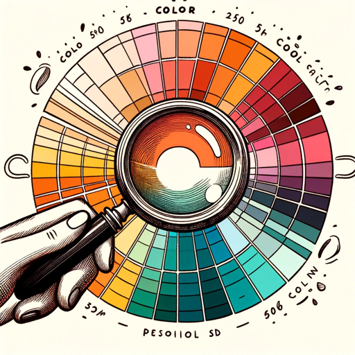
Style Guide Color Builder-industry-specific color schemes tool
AI-powered color accessibility and branding
Start »
Related Tools
Load More
CSS
Your personal highly sophisticated CSS copilot, with a focus on efficient, beautiful, scalable and high-quality production code

Color Palette
Professional color palette generator that will offer a modern combination of colors. It will generate a preview image, and will create HEX codes to help in the design process.
Brand Color Palette & Brand Kit generator
Create amazing brand color palettes and brand kits

Color Palette Creator GPT
Create and modify color palettes.

Free-Hue Guide
Guides artistic color exploration with 12 Seasons Color Analysis and Open Expressionism.
Color Season Style Scout
Personal shopper specializing in color seasons
20.0 / 5 (200 votes)
Introduction to Style Guide Color Builder
Style Guide Color Builder is a specialized tool designed to assist graphic designers, web developers, and branding professionals in creating cohesive, accessible, and effective color schemes. Its primary function is to help users build a structured color palette based on specific industries, themes, or logos, with a strong emphasis on accessibility for visually impaired individuals. The system allows for the selection of primary, secondary, and accent colors, ensuring they are appropriate for web design use and compliant with accessibility standards such as WCAG (Web Content Accessibility Guidelines). An example scenario is a web designer tasked with building a color scheme for a healthcare website. By using Style Guide Color Builder, the designer ensures that colors not only reflect the calming and trustworthy nature of the industry but also maintain legibility for users with visual impairments. The tool suggests colors that meet contrast requirements and are easily distinguishable by those with color vision deficiencies.

Core Functions of Style Guide Color Builder
Creation of Primary, Secondary, and Accent Colors
 Example
For an e-commerce website, the primary colors reflect the brand’s identity, secondary colors are used for interface elements like buttons or menus, and accent colors highlight promotional content.
ScenarioA fashion brand wants a sleek, modern look. The tool helps choose bold, contrasting colors for high-end product displays while maintaining accessible contrast for readability.
Ensuring Accessibility Compliance
ExampleWhen building a website for an educational institution, the tool recommends high-contrast combinations that meet WCAG guidelines to ensure text readability for all users.
ScenarioA university's website needs to accommodate a diverse audience, including those with vision impairments. Style Guide Color Builder suggests colors that guarantee clear, accessible communication across the site.
Theme or Industry-Specific Color Schemes
ExampleIn the financial services industry, users may opt for trustworthy blues or conservative grays. The tool helps create a palette that reinforces the industry’s values of trust and stability.
ScenarioA fintech startup uses the tool to select colors that reflect innovation (using accent colors) but also stability and trust through its primary palette of blues and muted grays.
Ideal Users of Style Guide Color Builder
Graphic and Web Designers
These professionals benefit from the tool’s ability to create industry-specific color schemes that are visually appealing and functional for both branding and UI/UX. The tool helps them streamline the process of choosing accessible colors that work well together in a digital context.
Branding Professionals and Marketing Agencies
Branding experts can use Style Guide Color Builder to ensure that the color palettes they develop for clients are both on-brand and universally accessible. This makes it easier to create memorable, effective marketing materials that meet the client’s visual identity needs.
Guidelines for Using Style Guide Color Builder
Step 1
Visit aichatonline.org for a free trial without login, no need for ChatGPT Plus.
Step 2
Choose the industry or sector for which you want to create a style guide. This could be healthcare, finance, technology, or any other field.
Step 3
Input primary colors based on the brand or theme. The tool will automatically generate accessible color schemes, ensuring compliance with accessibility standards for the visually impaired.
Step 4
Use the generated secondary and accent colors to refine the design. These will help emphasize important elements such as buttons, headers, or call-to-actions.
Step 5
Save or export your color palette as part of a complete style guide, which can then be used by web developers, UX/UI designers, or marketing teams.
Try other advanced and practical GPTs
Data Label Wizard
AI-powered labeling made simple

BibleGPT
AI-powered tool for biblical insights
The "What If" Historian
AI-powered tool to explore 'What If' history.

Making AI Content More Human
Transform AI content into human-like text

ASCII Art Creator
AI-powered ASCII Art Generator

Garden Design Maestro
AI-powered garden design for everyone.
Prompt Generator by EN
AI-powered prompt creation made simple

Rate My GPT
Track your GPT’s performance with AI-powered insights.

DivineAlgorithm.ai - HDF - AGI Simulation
AI-driven training simulation for safeguarding humanity

Moana Style Storyboard
AI-Powered Disney Style Storyboard Creation.

Misaki:メンタル心理カウンセラー
AI-driven emotional support and counseling

It's a thin line
AI-powered tool for minimal line art.

- Marketing
- Branding
- Web Design
- Accessibility
- UX/UI
Common Questions about Style Guide Color Builder
What is the main purpose of the Style Guide Color Builder?
The Style Guide Color Builder is designed to help users create accessible, industry-specific color schemes for web design, ensuring optimal usability and brand coherence.
How does it ensure color accessibility for the visually impaired?
It integrates algorithms that test for sufficient contrast ratios and color combinations compliant with WCAG (Web Content Accessibility Guidelines), ensuring all users can easily navigate your website.
Can I customize the generated color palette?
Yes, after generating a base palette, you can tweak individual colors to better fit your brand’s personality while still adhering to accessibility standards.
What types of design projects benefit from this tool?
This tool is ideal for web design, app development, marketing collateral, and branding projects where cohesive color schemes are critical to user experience.
Does Style Guide Color Builder support exporting style guides?
Yes, the tool allows you to export full style guides with color codes and their specific applications in various web design elements, making it easy to share with design teams.